Vietnamese headings on the web: when a display font eats the diacritics
A characterful display font with tight tracking made ầ, ữ, ợ and ệ collide. The fix: Be Vietnam Pro 800, -0.015em, line-height ~1.16, the vietnamese subset.

On this page
My portfolio went through three heading fonts in one afternoon. On 2026-10-01 at 14:56 I switched it from Space Grotesk and Inter to Be Vietnam Pro, because the site was hard to read and its Vietnamese marks looked cramped. At 15:34 a redesign brought in Bricolage Grotesque for display headings: variable, with an optical-size axis, the kind of face that makes a big headline look designed. At 16:06 Bricolage was gone again, and two minutes later I had to shrink the hero headline because the replacement font was wider.
The site is bilingual. The English headings looked great in Bricolage. The Vietnamese ones did not: stacked marks like the ones on ầ, ữ, ợ and ệ ran into the line above or the letter next to them. This post is what I changed and why, with the exact values from the commits, so the next time I fall for a pretty display face I check the Vietnamese page first.
Why Vietnamese is harder on a display font than English
Latin text in English barely uses the space above the cap height. Vietnamese uses it constantly, and it uses the space below the baseline too:
- Stacked marks above.
ầ,ẩ,ẫ,ế,ồcarry a circumflex and a tone mark on top of each other. They rise well above the height of a capital letter. - Marks below.
ợ,ệ,ạ,ụcarry a dot under the letter. - Horns.
ưandơhave a hook on the right side that reaches toward the next letter, andữ,ờ,ợstack a tone mark on top of that.
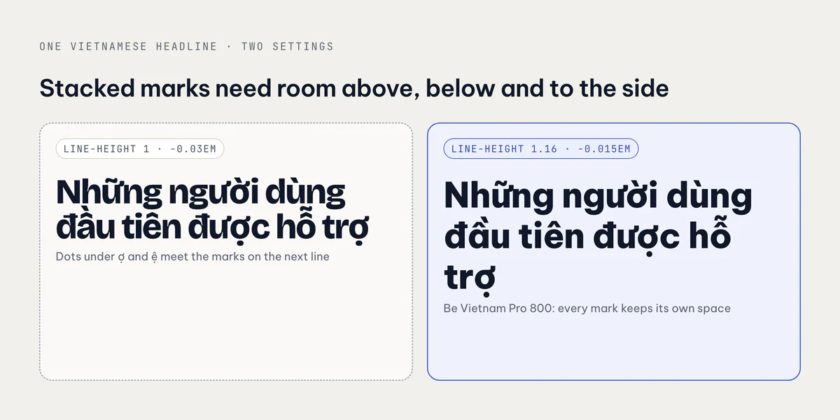
So one Vietnamese line needs room upward, downward and sideways. Headings are exactly where designers take that room away. Big display type usually gets line-height: 1 and negative letter-spacing, because at 80px the default spacing looks loose. In English that is a style choice. In Vietnamese it is a collision: the dot under ợ on line one meets the circumflex of ầ on line two, and a horn in a tightly tracked word touches its neighbour.
What the redesign shipped
This is what the 15:34 redesign put in globals.css and layout.tsx:
.text-display {
  font-family: var(--font-display); /* Bricolage, then Be Vietnam Pro */
  font-size: clamp(2.6rem, 6vw, 5.5rem);
  line-height: 1;
  letter-spacing: -0.03em;
  font-weight: 750;
}

.text-h2 {
  font-size: clamp(2rem, 3.6vw, 3.25rem);
  line-height: 1.04;
  letter-spacing: -0.035em;
}const bricolage = Bricolage_Grotesque({
variable: "--font-bricolage",
subsets: ["latin", "vietnamese"],
axes: ["opsz"],
display: "swap",
});Note what was not wrong. Bricolage Grotesque ships a Vietnamese subset, and I loaded it. Every glyph rendered in the right family, no fallback boxes, no mixed fonts. The comment in the code even said so: "diacritics render in-family". Having the glyphs is necessary, but it is not enough. The face was drawn tight and characterful, and then I made it tighter with line-height: 1 and -0.03em to -0.035em tracking. The marks were all there. They just had nowhere to go.
The blog covers had the same problem. Their title used the display font at line-height: 1.08 and letter-spacing: -0.03em, and a long Vietnamese title over two or three lines was the worst case.
The fix: a face drawn for Vietnamese, and air
Commit 905b8bd ("Readable headings…") made three changes.
1. Headings use Be Vietnam Pro, the body font, at weight 800. Be Vietnam Pro was designed for Vietnamese, so its stacked marks have proper spacing at every weight. Dropping the second family also means one less font file on every page.
--font-display: var(--font-be-vietnam-pro), ui-sans-serif, system-ui, sans-serif;2. Tracking and line-height loosen to values that leave room for the marks:
| Before | After | |
|---|---|---|
.text-display | lh 1, -0.03em, 750 | lh 1.12, -0.02em, 800 |
.text-h2 | lh 1.04, -0.035em | lh 1.16, -0.015em |
| Blog cover title | lh 1.08, -0.03em | lh 1.17, -0.012em |
Roughly: line-height between 1.12 and 1.17, tracking around -0.015em. Still tighter than body text, still reads as a headline, and the dot under ợ no longer meets the next line.
3. Load the weight you ask for. Be Vietnam Pro on Google Fonts is not a variable font, so next/font loads only the weights you list. The redesign had dropped 800 from that list. If CSS asks for 800 and only 700 is loaded, the browser quietly uses 700, and you wonder why the headline looks lighter than the design.
const beVietnamPro = Be_Vietnam_Pro({
  variable: "--font-be-vietnam-pro",
  subsets: ["latin", "vietnamese"],
  weight: ["400", "500", "600", "700", "800"],
  display: "swap",
});Subsets: the line that was missing an hour earlier
The subsets line deserves its own section. Before 14:56 the site used Space Grotesk and Inter, both imported with subsets: ["latin"] and nothing else. The comment I wrote when replacing them says Be Vietnam Pro keeps its stacked marks spaced "at every weight, which Space Grotesk/Inter did not", so the main reason for that first switch was the design of the marks, not the subset. But the subset list was wrong too.
In next/font, subsets decides which parts of the font are preloaded with the page. Leave vietnamese out and the Vietnamese characters are not in the files the page asks for up front. With display: "swap", a heading can then paint first with whatever is available and fix itself later, so for a moment ư or ế comes from a different typeface than the letters around it. On a hero headline that is the first thing a visitor sees.
The rule I follow now: every font on a site with Vietnamese text gets subsets: ["latin", "vietnamese"], including the monospace one. My JetBrains Mono import has it too, because dates and code in the Vietnamese posts use it.
Then the hero broke
Two minutes after the heading fix I had a new problem. Be Vietnam Pro at 800 is wider than Bricolage. The hero headline, "Your app, web and backend, shipped.", sits in a column next to three phone screens, and at the old maximum size of 5.5rem the wider glyphs no longer fit three to a line. With text-balance on, the browser spread the words evenly, which meant nearly one word per line, a tall ragged tower instead of a headline.
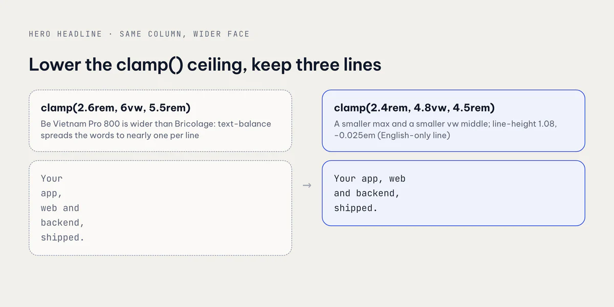
The fix in b4bcfb5 was to lower the ceiling of the clamp(), not to widen the column:
.text-display {
  font-size: clamp(2.4rem, 4.8vw, 4.5rem); /* was clamp(2.6rem, 6vw, 5.5rem) */
  line-height: 1.08;
  letter-spacing: -0.025em;
  font-weight: 800;
}
Every part of the clamp changed. The maximum drops from 5.5rem to 4.5rem so the line fits on a laptop. The fluid middle drops from 6vw to 4.8vw, which is what decides the size between phone and desktop. The minimum drops a little for small phones. With those, the headline is back to three lines.
One honest note: the hero is tighter again (1.08, -0.025em) than the section headings. That line is English only and has no stacked marks, so it can afford it. Vietnamese headings keep the looser values. If your hero is translated, keep it at the looser ones too.
How I check it now
Typography bugs like this pass every automated check. Nothing errors, the font loads, the layout does not shift. You only see it by looking. So my check is manual and specific:
- Open the Vietnamese page, not the English one, at desktop width and at phone width.
- Find the longest heading that wraps onto two or more lines. That is where marks from one line meet the next.
- Look for a test word with everything:
Những người dùng đầu tiênhas a horn with a mark (ữ), a stacked circumflex (ầ) and marks below. If it reads cleanly over two lines, the settings are fine. - Check the blog covers too, since they render the same title at a fixed width. They come from the same theme tokens through my headless Chrome image script.
Takeaways
- A font that "supports Vietnamese" only means the glyphs exist. Whether they have room depends on the face's design and on your line-height and tracking.
- Vietnamese needs space above (stacked marks), below (dots) and to the side (horns). Display settings like
line-height: 1and-0.03emtake away all three. - For Vietnamese headings I use Be Vietnam Pro 800, line-height about 1.12 to 1.17 and tracking around -0.015em.
- Put
subsets: ["latin", "vietnamese"]on everynext/fontimport, and list every weight your CSS uses. - When a wider face breaks a headline into one word per line, lower the
clamp()maximum and itsvwmiddle instead of fighting the layout. - Review typography on the Vietnamese page, on the longest wrapping heading. No build step will catch it for you.
The site this happened on is vanthuongdao.id.vn; the apps it showcases are at apps.vanthuongdao.id.vn.
Related posts