Blog covers and diagrams from HTML with headless Chrome, no Playwright
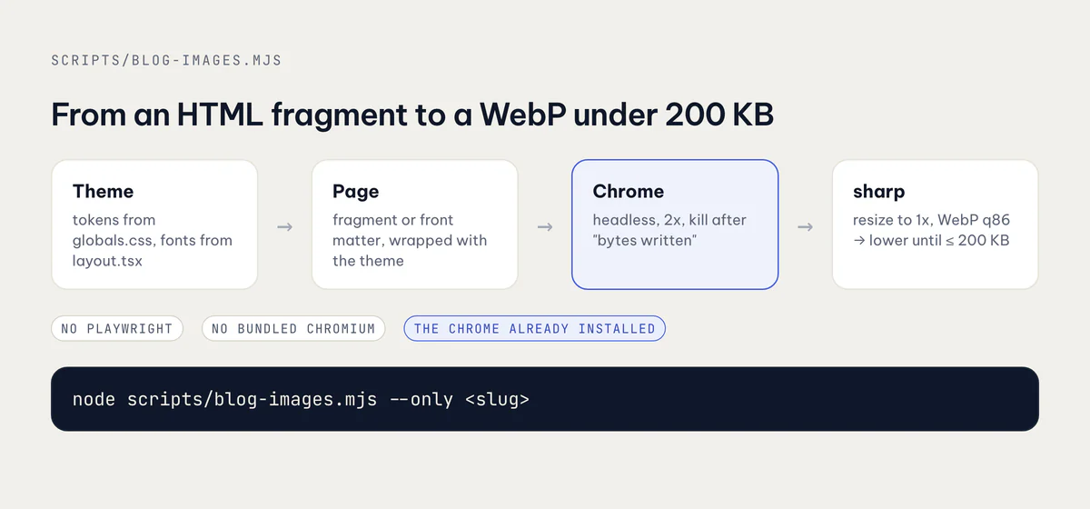
One Node script renders every cover and diagram on my blog with the Chrome already on my Mac: theme tokens from the site's CSS, a 2x render, WebP under 200 KB.

On this page
Every post on this blog has two covers (English and Vietnamese) and usually two or three diagrams per language. Twelve posts at launch meant 24 covers and several dozen diagrams, and I redesigned the covers once on the same day they first shipped. Drawing those by hand in a design tool was never going to happen. So they are all HTML, and one Node script turns that HTML into WebP files.
The script is scripts/blog-images.mjs, just under 400 lines. It uses the Google Chrome that is already installed on my Mac, in headless mode, plus sharp for the WebP step. No Playwright, no Puppeteer, no bundled Chromium. This post walks through how it works and the three things that took the longest to get right: where the colors come from, how to know Chrome is done, and how to keep every file under 200 KB.
Why plain Chrome and not Playwright
Playwright is the usual answer for "screenshot some HTML". It is also a large dependency that downloads its own browser builds, and I have a standing rule on this machine not to use Playwright or a bundled Chromium. I already have Chrome. Chrome has had a --screenshot flag in headless mode for years. For a static page with no clicks, no waiting on network calls and no assertions, that flag is the whole feature I need.
The whole interface is one command:
npm run blog:images                          # every cover and diagram
node scripts/blog-images.mjs --only <slug>   # one post
node scripts/blog-images.mjs covers          # or: diagrams
There are two helpers for photos as well: strip puts phone screenshots side by side on the diagram background, and shot resizes one screenshot. Both only use sharp.
Colors and fonts come from the site, not the script
The first rule, written at the top of the file: colors and fonts are not defined in the script. It reads them from the site.
- Colors: it parses
src/app/globals.css, takes the raw tokens from:root, then the@themenames that point at them, and writes them all into a:root { … }block in the page it renders. - Fonts: it reads the
next/fontimports insrc/app/layout.tsxwith a regex, turningBe_Vietnam_Pro({ variable: "--font-be-vietnam-pro" … })into the family nameBe Vietnam Pro, and links those families from Google Fonts at weights 400 to 800.
for (const m of layout.matchAll(/=\s*([A-Z][A-Za-z_]+)\(\{\s*variable:\s*"(--[\w-]+)"/g)) {
  const family = m[1].replace(/_/g, " ");
  families.push(family);
  vars[m[2]] = `"${family}"`;
}
The payoff came on 2026-10-01, when I changed the site's heading font in the afternoon (the Vietnamese diacritics story). Re-running the script was all it took for every cover and diagram to use the new font. Nothing in the images had to be edited.
The Google Fonts link uses display=block, not swap. On a website swap is kinder. For a screenshot it is wrong, because the first paint might use a fallback font, and that paint might be the one that gets captured.
The regex that matched the wrong block
One bug here produced no error at all. My globals.css has two @theme blocks: a Tailwind v4 @theme inline { … } that holds every color and font token, and a small @theme { … } further down with two easing curves. The script was looking for @theme {:
// before: skips "@theme inline {" and finds the easing block instead
css.match(/@theme\s*{([\s\S]*?)\n}/)
// after: the first @theme block, inline or not
css.match(/@theme[^{]*{([\s\S]*?)\n}/)
So the old pattern did match something, just the wrong thing: two easing curves and no colors. Every color variable in the rendered page was undefined, and CSS treats an undefined variable as "use the default", not as a failure. The fix shipped in 905b8bd along with the cover redesign. If you build a pipeline like this, print how many color tokens you found. A number that low should stop the run.
Diagrams written months ago use an older ink scale (--color-ink-100 … --color-ink-950) and --color-accent. Instead of rewriting them, the script maps those names onto the current palette, so old and new diagrams look the same.
Diagrams: HTML fragments with a few classes
A diagram is a small HTML fragment in content/blog/<slug>/diagrams/<name>.<lang>.html. It has no <head> and no styles of its own. The script wraps it in a page that carries the theme and a short stylesheet of layout classes: canvas, kicker, title, row, col, grow, box (with box-accent, box-bad, box-dark), tag, arrow, mono. That is the whole design system for diagrams, and it is what keeps fifty of them looking like one set.
The default canvas is 1200×675. A comment on the first line overrides it:
<!-- size: 1200x560 -->
<div class="canvas">
  <div class="kicker">One task, one worktree</div>
  <div class="title">The lifecycle every agent follows</div>
  <div class="row">…</div>
</div>
The language comes from the file name, and the output goes to public/blog/<slug>/<name>.<lang>.webp, the path the Markdown points at.
Covers: generated from the front matter
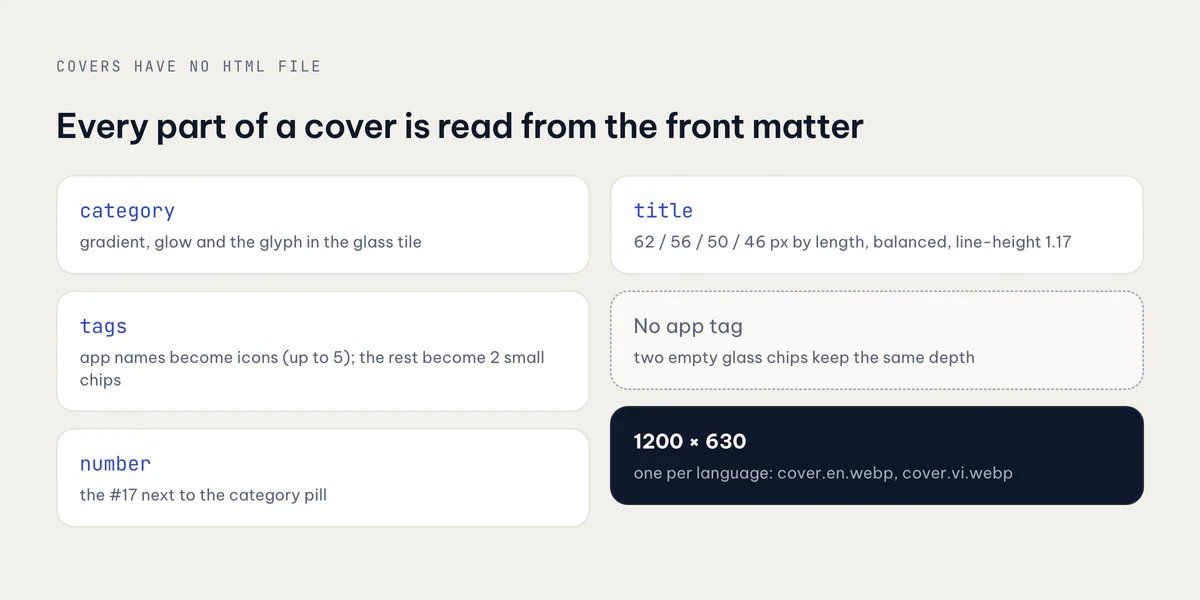
Covers have no HTML file at all. The script builds them from each post's front matter:
- Palette by category. Each of the five categories has a two-stop gradient and a glow color: engineering is slate to near-black with a blue glow, monetization is green with a yellow glow, growth is coral to deep red, and so on. A glyph for the category sits in a frosted tile on the right.
- App icons from tags. If a post is tagged with one of my apps (
Lockboxy,Talkzy, …), that app's icon orbits the tile, up to five, in fixed positions so every cover has the same rhythm. A general indie-apps post shows the family. A post with no app gets two empty glass chips so the depth stays the same. - Title size from title length. 62px for short titles, then 56, 50 and 46 above 44, 58 and 72 characters. The title uses
text-wrap: balance, line-height 1.17 and tracking -0.012em, which is what Vietnamese titles need. - The number comes from the front matter's
numberfield, falling back to the post's position in the folder list.
Tags that are app names are removed from the small tag chips, so a Lockboxy post does not show its icon and a "Lockboxy" chip next to each other.
Chrome does not exit, so watch for "bytes written"
This took the longest to understand. On macOS, headless Chrome writes the screenshot and then often just stays running. If your script waits for the process to exit, it waits forever on some files and not on others.
So the render is considered done when Chrome says it wrote the file. Chrome prints a line containing bytes written to file. The script listens on stdout and stderr, waits 150 ms after that line, and kills the process:
const child = spawn(CHROME, [
  "--headless=new",
  "--disable-gpu",
  "--hide-scrollbars",
  `--user-data-dir=${path.join(tmp, "profile")}`,
  "--force-device-scale-factor=2",
  `--window-size=${width},${height}`,
  "--virtual-time-budget=6000",
  `--screenshot=${outPng}`,
  `file://${file}`,
]);
const onData = (d) => {
  log += d;
  if (/bytes written to file/.test(log)) setTimeout(() => finish(), 150);
};
The other flags each fix a smaller problem:
--user-data-dirpoints at a fresh temp folder. Without it, headless Chrome can collide with the Chrome you are using, which is open with your normal profile.--virtual-time-budget=6000gives the page up to six seconds of virtual time to load its web fonts and images before the screenshot.--force-device-scale-factor=2renders at 2x. More on that below.- A 60-second timer kills Chrome and fails the run if the line never appears, so one bad file cannot hang the whole batch.
Images inside covers (the app icons, my avatar) are loaded with file:// paths from public/, which works because the page itself is a file:// URL.
2x in, 1x out, under 200 KB
Chrome renders every image at device scale factor 2, so a 1200×630 cover is captured as a 2400×1260 PNG. sharp then resizes it back to 1200×630 and encodes WebP. Rendering big and scaling down gives cleaner text edges and smoother gradients than rendering at 1x, which matters most for small diagram labels.
The size limit is a loop, not a guess:
let quality = 86;
do {
  buf = await sharp(input)
    .resize({ width, height, fit: "cover", withoutEnlargement: true })
    .webp({ quality, effort: 6, smartSubsample: true })
    .toBuffer();
  quality -= 6;
} while (buf.length > 200 * 1024 && quality > 30);
Start at quality 86, step down by 6 until the file fits in 200 KB. In practice it almost never loops. A diagram is flat color and text, and WebP compresses that very well: the worktree post's diagrams are 25 to 43 KB each. The covers grew from about 26–29 KB to 32–49 KB when I added gradients, glow and app icons, still far under the limit. The loop is there for the strips of real screenshots, which are photographs and much heavier.
Each file is logged with its size, so a regression is visible in the terminal:
public/blog/<slug>/cover.en.webp 1200x630 41 KBTakeaways
- For static HTML-to-image, headless Chrome's
--screenshotflag is enough. You do not need Playwright for a page nobody clicks. - Read colors and fonts from the site's own CSS and font imports, so a re-theme is one re-run. Treat "found almost no tokens" as an error.
- Use
display=blockfor web fonts in a screenshot, and give the page a--virtual-time-budgetto load them. - On macOS, do not wait for headless Chrome to exit. Wait for "bytes written to file", then kill it, with a timeout behind that.
- Use a throwaway
--user-data-dirso the render never touches your real Chrome. - Render at 2x, downscale with
sharp, and step WebP quality down in a loop until the file fits your budget.
The apps whose icons end up on these covers are all at apps.vanthuongdao.id.vn.
Related posts