Getting a private vault app through App Review after 2.5.1 rejections
How Lockboxy got from three guideline 2.5.1 rejections to approval: a new default screen, swept onboarding, a rewritten listing and plain review notes.

On this page
Lockboxy is my encrypted vault for iPhone: photos, videos, files, passwords and notes, encrypted on the device behind a passcode only the owner knows. Getting its first version onto the App Store took from July to early September 2026. Guideline 2.5.1 (Software Requirements) was cited in three letters in a single week, and it came back three more times after I thought I had fixed it.
This post goes through what actually changed between those letters and the approval, using the working log I kept in the repo while it was happening. None of the fixes were clever. Most of them came down to one thing: the build, the listing and the screenshots had to describe the same app.
The rejections, and what I got wrong first
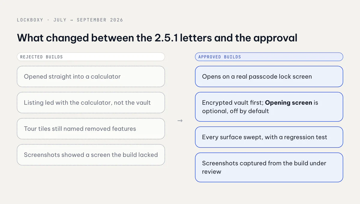
The first submission went in on 21 July. Over the next five days four letters came back. Guideline 2.5.1 showed up in three of them, alongside 3.1.2(c) (the EULA link was only in the Vietnamese description, not the English one) and 2.1(b) (the reviewer could not find the in-app purchases). Each 2.5.1 letter used the same wording. It tied the finding to the Photos API and to the way the app presented its main photo feature.
My first mistake happened before I had even read the letters properly. I assumed the problem was that the calculator screen looked too much like Apple's own Calculator, so I built a full redesign of it: new keys, a new palette, a new layout. When I finally opened every letter in App Store Connect, none of them said anything about how the calculator looked. The redesign was worth keeping, because the old skin really was a near pixel copy of iOS Calculator, but it answered a finding Apple never wrote.
Read the real letters in App Store Connect before you scope a fix. A summary from memory, or from someone else, is how you lose a round.
The second realisation: as far as I can tell, Apple didn't need to run the app to write the 2.5.1 letter. The listing itself said it all: the description and keywords led with the calculator screen instead of the vault. Three code-only fixes could never have cleared it.
Change 1: the default screen
On 11 August I made a reversible experiment out of it and took Apple at their word. The app now opened on an ordinary passcode lock screen: a 4-digit pad, Face ID, and a "Forgot your passcode?" link. Everything built around the calculator entry came out of routing and Settings. The database schema, key slots and crypto paths stayed exactly as they were. A review experiment is the worst possible reason to do surgery on the security core.
One detail I nearly missed: the optional Recovery Key is an 80-digit string, and before this change it could only be typed on the calculator keypad. A 4-digit lock pad can't take it, so the lock screen needed a real text field behind "Forgot your passcode?". Without that, anyone who forgot their PIN would have lost the vault for good. When you remove an entry point, check what else was only reachable through it.
Change 2: the whole listing, not just the text
I rewrote the name, subtitle, description and keywords in both English and Vietnamese the same day. The description now opened with "Lockboxy is a private, encrypted vault that lives on your device", and the keyword "hide photos" came out, along with anything that described the app as something other than a vault.
Build 12 cleared 2.5.1 on 12 August, and two narrower findings replaced it:
- 5.1.1(ii): the camera purpose string was accurate but vague, and it never mentioned the front camera capture used by Intruder Selfie. I rewrote the camera and microphone strings to name every use.
- 2.3: the reviewer could not find, in the app, a screen that the screenshots advertised.
That second one was my fault. My checklist said "name, subtitle, description, keywords", and it left out the screenshots, which were the loudest part of the listing. App Store metadata includes promotional text, screenshots and app previews for every localization, and iPad sets are separate from iPhone sets. That review had run on an iPad. I also had to ship a build whose only purpose was to make two in-app strings match the screenshots I had just handed over, because "the screenshots don't match the app" is exactly what 2.3 means.
Change 3: onboarding, which I had swept and still missed
On 13 August 2.5.1 came back. The letter repeated the July text word for word and the Review Device field was blank. I didn't guess at a seventh code change. I replied in Resolution Center with four facts that could be checked in the code, and asked which feature, on which screen, and which Photos API call. The answer dropped 2.5.1 and named a real bug: the Share button in the private browser did nothing on an empty tab. It was disabled, and the only sign was a small colour change. I fixed it so the button always responds with a short message.
On 16 August 2.5.1 came back again. This time the Review Device field was filled in, so they had run the binary. The cause was the first-run feature tour. I had cleaned up its prose, but its icon grids reused locale keys from Settings rows I had deleted. The keys were still in the locale file, so the tour kept compiling and kept showing tiles for features that no longer existed, on the very first screen a reviewer sees. My route-level searches came back clean because no route was involved.
Removing a feature means sweeping every surface that names it, not every surface that routes to it. The fix added a regression test that fails the build if any removed feature name shows up in the tour again.
Change 4: review notes that tell the reviewer how to get in
A vault with no demo account is hard to review if nobody explains it. The notes I settled on had three short parts:
1) WHAT CHANGED IN THIS BUILD
2) HOW TO OPEN THE APP
   No demo passcode. On first launch you create your own 4-digit passcode,
   confirm it, then enter it on the lock screen.
3) HOW TO FIND THE IN-APP PURCHASES
   Settings tab > "Go Premium" card. All three products are listed there.
The last round was 2.1(b) again. A screenshot attached to the rejection showed an App Store sandbox account error over a paywall that had loaded its products correctly. I answered with that, plus a purchase I had reproduced on the reviewer's own storefront, and added on-screen StoreKit error codes in build 17. Version 1.0.1 was released on 9 September.
Bringing the opening screen back on different terms
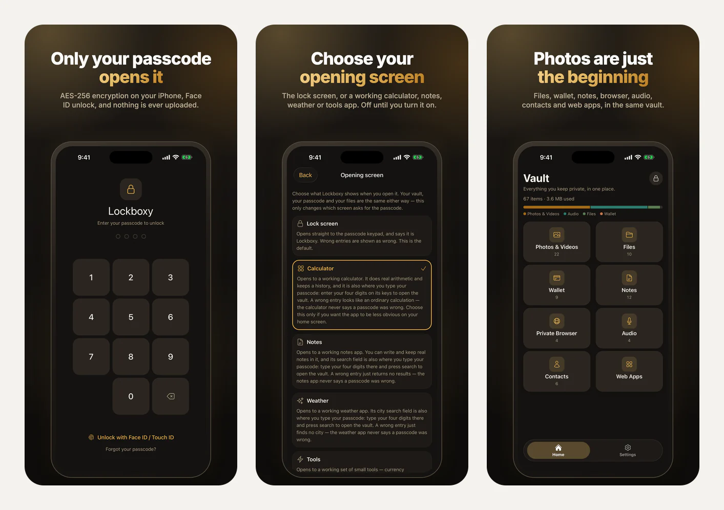
Once 1.0.1 was live, I brought the calculator back in version 1.2.0 as an optional opening screen. The rules were the opposite of before:
- Off by default. A fresh install opens on the lock screen.
- Chosen by the user under Settings › Security › "Opening screen", and undone from the same screen in one tap.
- Explained before it can be turned on. Each option says it really works and names the exact field the passcode goes into. A unit test fails if that text gets trimmed, and VoiceOver reads the full explanation, not just the title.
- Not behind Premium, so a reviewer can reach it without a sandbox purchase.
The listing describes it the same way, in its own "OPENING SCREEN (OPTIONAL)" section: "It is off unless you turn it on, under Settings › Security › "Opening screen"." Version 1.2.6 went through with that wording, and I have kept it in every locale since. I later changed the in-app Terms to match it as well.
What I'd do again
- Read the actual letter, and note whether the Review Device field is filled in. If it's a blank, repeated letter, ask a specific question. If it's filled in, look harder at the binary.
- Treat the listing as part of the build: name, keywords, description, promotional text, screenshots and previews, in every locale and for every device class.
- Grep for the names of anything you remove, and put a test on it.
- Disclose risky features yourself in the review notes and offer to remove them. A later version carried an off-by-default feature that touches the photo library; the notes described it and offered to take it out, and it passed.
You can see Lockboxy at lockboxy.io.vn and my other apps at apps.vanthuongdao.id.vn. The encryption side, meaning what the passcode actually protects, is in On-device encryption in a React Native vault.
Related posts